Understanding the Core of Layout Creation
Creating a layout is a fundamental skill that bridges the gap between an idea and a visual reality. Whether you are designing a website, a flyer, a magazine page, or even an office floor plan, the principles remain remarkably consistent. A layout is not just about placing elements on a canvas; it is about guiding the viewer's eye, communicating a message clearly, and creating a satisfying visual experience. Many beginners feel intimidated by the process, but breaking it down into a systematic, step-by-step approach makes it accessible to anyone. The journey from a blank page to a polished design involves planning, structuring, and refining until every component serves a purpose.
The first step in understanding layout creation is to recognize that it is a problem-solving exercise. You are solving the problem of how to present information in a way that is easy to understand and visually appealing. This requires you to think about the user or the reader before you even draw a single line. By adopting a methodical workflow, you can avoid common pitfalls such as cluttered designs, poor readability, and misaligned elements. The process is iterative, meaning you will go back and forth between steps, but having a clear sequence helps maintain focus and direction.
Defining the Purpose and Your Audience
Before you open any software or pick up a pencil, you must clearly answer two fundamental questions: what is the goal of this layout, and who is it for? The purpose of a layout in a business report is vastly different from the layout of a children's book. If you are designing a website layout for a bakery, the primary goal might be to drive customers to place online orders. Your audience is likely people looking for fresh bread or custom cakes. This means the layout must prioritize menu items, the order button, and high-quality images of baked goods. In contrast, a layout for a legal document needs to prioritize readability, clear hierarchy of text, and a formal, uncluttered structure.
Understanding your audience also dictates the tone and complexity of the layout. A layout for a tech startup audience can be more modern, with asymmetrical grids and bold typography. A layout for a retirement community newsletter should prioritize large, legible fonts, high contrast, and a more traditional, reassuring structure. By defining these parameters early, you create a filter for every design decision you make. Every color, font, image placement, and spacing choice should align with the defined purpose and audience. This alignment is what makes a layout feel intentional and effective, rather than random or confusing.
The Power of Sketching and Wireframing
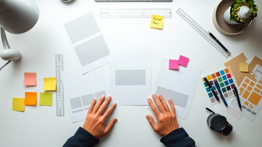
Once you have a clear understanding of the goal and audience, the most effective next step is to grab a pencil and paper. Sketching, often called wireframing when done digitally, is the process of creating quick, low-fidelity representations of your layout. This stage is purely about structure and composition, not about beautiful colors or perfect fonts. The reason this step is so powerful is that it allows your brain to explore multiple possibilities without the distraction of details. You can sketch ten different layouts for the same content in ten minutes and decide which one has the best flow.
During sketching, focus on the arrangement of major blocks: where the header goes, where the main content area is, where images sit, and where the call-to-action button or footer appears. Do not worry about exact sizes or proportions at this point. The goal is to experiment with different visual hierarchies. For example, if you are creating a layout for a landing page, you might try one sketch where the headline is at the top center and another where the headline is on the left with a large image on the right. This rapid exploration helps you discover the most effective way to present your information before you invest time in detailed digital work.
Establishing visual hierarchy
Visual hierarchy is the principle of arranging elements to show their order of importance. It is the backbone of any effective layout. Without hierarchy, a layout feels flat and overwhelming because the user does not know where to start looking. The human eye tends to scan content in predictable patterns. For text-heavy layouts, such as blogs or news articles, the F-pattern is common. Users first scan across the top, then down the left side, and then across again in shorter lines. For visual-heavy layouts, like portfolios or product pages, the Z-pattern is often used, where the eye moves from the top left to the top right, then diagonally down to the bottom left, and across to the bottom right.
You can establish hierarchy through several visual techniques. Size is the most powerful tool: larger elements are seen as more important. Color and contrast also play a role; a bright red button on a white background immediately draws attention. Placement is another key factor: items placed higher on the page or in the center of the layout are generally perceived as more significant. Spacing can also dictate hierarchy by isolating an element with generous white space, making it stand out as a focal point. By consciously applying these techniques, you can control the reading sequence and ensure that the most critical information, such as the headline and main call to action, gets the attention it deserves before secondary details.

The strategic use of white space
White space, also known as negative space, refers to the empty areas around and between elements in a layout. Many beginners feel the urge to fill every inch of the canvas with content, images, or decorative elements, but this is a mistake. White space is not wasted space; it is a powerful design tool that improves readability, creates focus, and gives the layout a clean, professional feel. Think of it as the breathing room that allows each element to be seen clearly. When white space is used effectively, the user can navigate the content without feeling cluttered or overwhelmed.
There are two main types of white space: micro and macro. Micro white space is the small gaps between lines of text, between a letter and the edge of a button, or between a headline and the body text. Macro white space is the larger empty areas, such as the margins of a page or the generous gap between a content block and a sidebar. Both are essential. For example, increasing the line height (leading) of a paragraph is a form of micro spacing that dramatically improves legibility. Margins around the entire layout are a form of macro spacing that prevents the content from feeling cramped against the edge of the screen or page. By deliberately leaving areas empty, you guide the user to focus on what truly matters.
Applying grid systems for consistency
A grid system is a framework of vertical and horizontal lines that help you organize and align elements in your layout. It is one of the most reliable tools for achieving consistency and balance. A grid divides your canvas into columns, rows, and modules. The most common grid for web and print is the column grid, which typically uses 12 columns for maximum flexibility. You can then span content across one, two, three, or more columns to create different visual weights. The grid ensures that everything from the logo to the footer aligns perfectly, creating a sense of order that users find comfortable and easy to navigate.
There are also established proportional systems that can be integrated with grids, such as the Rule of Thirds and the Golden Ratio. The Rule of Thirds divides the canvas into a three-by-three grid. Placing key elements along these lines or at their intersections creates a more dynamic and interesting composition than placing everything in the center. The Golden Ratio, approximately 1.618 to 1, is often used to determine harmonious proportions between elements like a sidebar and a main content area. While you do not need to be mathematically precise in every layout, being aware of these principles helps you make informed decisions about size and placement.
Ensuring accessibility and responsiveness
In modern layout design, accessibility and responsiveness are not optional; they are essential requirements. Accessibility means ensuring that your layout can be used by people with various disabilities, including visual, auditory, motor, and cognitive impairments. For example, you must ensure there is sufficient contrast between text and background colors. Low contrast, like light gray text on a white background, is difficult for many people to read. You also need to choose legible fonts and avoid using color alone to convey information, as colorblind users may not perceive the difference. A good rule of thumb is to design for clarity from the start.
Responsiveness, particularly for digital layouts, means designing a layout that adapts and looks good on any screen size, from a desktop monitor to a smartphone. This requires planning your layout with a flexible grid. Instead of fixed pixel widths, use relative units like percentages or viewport widths. You also need to plan for breakpoints, which are specific screen widths where the layout reflows. For example, a three-column layout on a desktop might stack into a single column on a mobile phone. Testing your layout on actual devices or using browser developer tools is the only way to ensure it works correctly. Ignoring responsiveness can alienate a huge portion of your audience.
Tools for digital execution
Once your sketches are finalized and your grid is planned, you move into the execution phase using digital tools. For web and app layouts, industry-standard tools include Figma, Adobe XD, and Sketch. These are vector-based design tools that allow for precise control over elements, easy creation of interactive prototypes, and seamless collaboration with team members. They come with features like auto-layout, which automatically adjusts spacing and alignment as you add or remove content, making iterative design much faster. For simpler projects or for those who are not professional designers, tools like Canva offer drag-and-drop interfaces with pre-built layout templates that can be customized.
For print layouts, Adobe InDesign is the industry leader, providing powerful typography controls and multi-page document management. For office or floor plan layouts, specialized software like EdrawMax or even the shapes tool in Microsoft Word can be surprisingly effective. The choice of tool should depend on the complexity of the project and your skill level. However, the principles of layout design remain the same regardless of the software. The tool is merely a means to execute your vision. It is more important to understand the why behind your design decisions than to master every feature of a particular program.
Step-by-step checklist for your layout
To help consolidate the entire process, here is a practical step-by-step checklist that you can apply to any layout project.
- Define the primary goal of the layout and identify the target audience.
- Research and gather all content, including text, images, and data that will be used.
- Create three to five rough pencil sketches or low-fidelity wireframes exploring different compositions.
- Select the strongest sketch and refine it into a more detailed wireframe, defining the grid structure.
- Establish the visual hierarchy by deciding which element is most important and how to emphasize it using size, color, or placement.
- Add all content to the wireframe, focusing on alignment and spacing without worrying about final aesthetics.
- Evaluate the use of white space. Remove any element that does not support the primary goal.
- Apply typography choices, ensuring font pairing is harmonious and body text is highly legible.
- Integrate colors, images, and graphics that align with the brand or purpose of the layout.
- Test the layout for accessibility, contrast ratios, and, if digital, for responsiveness across devices.
- Gather feedback from peers or users and make revisions to improve clarity and impact.
- Finalize the layout, exporting it in the appropriate format for its intended use.
Comparing popular layout tools
To make an informed choice about which tool to use, it helps to compare their primary use cases and strengths. The table below provides a quick overview of four common layout creation tools.
| Tool | Best Use Case | Key Strength |
|---|---|---|
| Figma | Web and app UI design | Real-time collaboration and auto-layout |
| Adobe InDesign | Print publications and multi-page documents | Advanced typography and master pages |
| Canva | Social media graphics and beginners | Drag-and-drop simplicity with templates |
| EdrawMax | Office layouts and floor plans | Specialized symbols and scaling tools |
Choosing the right tool can significantly affect your workflow. For collaborative web design, Figma is hard to beat. For print, InDesign is the standard. For beginners or quick projects, Canva offers a very low barrier to entry. Understanding what each tool does best allows you to leverage it effectively.
Common mistakes and how to avoid them
Even experienced designers can make mistakes when creating layouts. One of the most frequent errors is ignoring the grid. When elements are not aligned with a visible or invisible grid, the layout feels messy and unprofessional. The solution is to always enable gridlines or guides in your software and snap elements to them. Another common mistake is neglecting the importance of margins and padding. Placing text or images too close to the edge of the page or screen creates tension and can make the layout feel cheap. Always provide adequate margin space around the entire perimeter of your layout.

Another pitfall is using too many different typefaces or colors. A layout with ten different fonts and a rainbow of colors will appear chaotic and confusing. The general best practice is to use no more than two, or at most three, typefaces in a single layout, and to stick to a limited color palette that supports branding or mood. Additionally, designers sometimes forget about the user's reading experience. Long blocks of uninterrupted text without subheadings, images, or white space will cause users to lose interest. Break up content using the principles of hierarchy and spacing to maintain engagement. Finally, always proofread your text and check for alignment errors before finalizing.
Practical application of layout principles
To solidify your understanding, it is useful to practice applying these principles to different types of layouts. For instance, consider creating a simple website homepage. Start by sketching a header with a logo and navigation. Then a hero area with a headline, subtext, and a button. Below that, a three-column grid with feature descriptions, and finally a footer with links and legal information. Apply the Z-pattern to guide the eye from the logo to the call-to-action button. Use plenty of white space around the button to make it prominent. Ensure the entire layout is responsive by planning how the three columns will stack on a mobile screen.
For a print example, take a newsletter. Decide on a two-column grid for text and images. Place the most important article at the top left, as that is where the eye naturally goes first. Use a large pull quote or an image to break up the text in the second column. Ensure that the headline font contrasts well with the body font. Leave 0.5 to 1 inch of space on all margins. Check the contrast of any colored text over background images. By methodically going through these steps, you train your eye to see the layout as a structured system rather than a collection of random parts.
Resources for further learning
Developing strong layout skills is a continuous journey. There are many excellent resources available online to help you deepen your understanding and refine your technique. Study the work of professional designers and analyze why their layouts feel effective. Pay attention to the grid use, white space, and hierarchy in magazines, websites, and posters you encounter every day. The more you practice, the more instinctive these principles will become.
For structured learning, you can explore tutorials from platforms like Canva Design School, which offers practical guides on using layouts directly within their tool. For a more technical perspective on web layout, resources like Hostinger Tutorials provide step-by-step instructions on how to create website layouts, covering both design and implementation aspects.
References
Canva. "Usar layouts (Use layouts)." Canva Design School. Accessed October 2023. https://www.canva.com/pt_pt/help/using-layouts/
Hostinger Tutorials. "How to Create a Website Layout (in 6 Steps)." Hostinger. Accessed October 2023. https://www.hostinger.com/br/tutoriais/como-fazer-o-layout-de-um-site